Preview To 2022

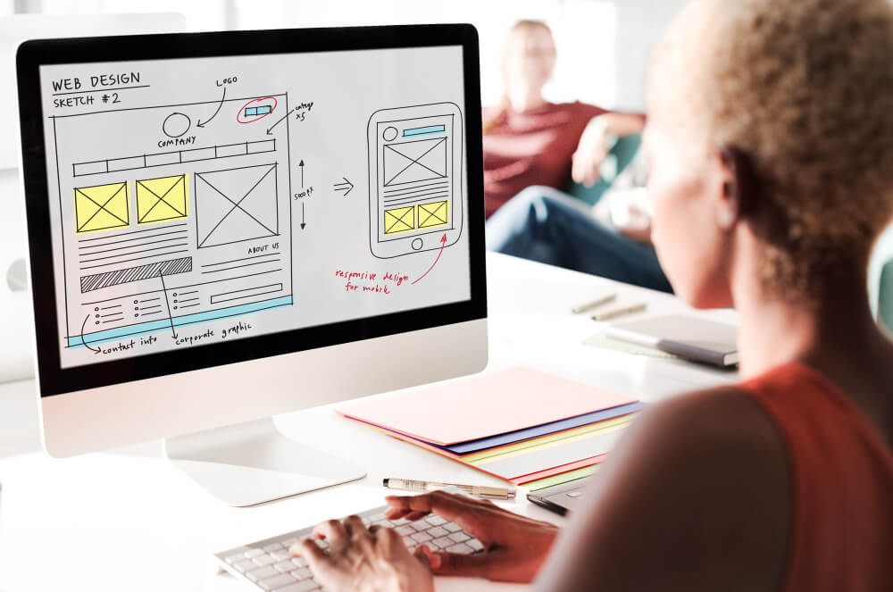
Humans rely highly on their senses, especially visual senses, to determine what is good or bad for them. They need to be appealed by what they are seeing. By receiving 80% of the information through visual resources, it is essential for you, as an e-commerce vendor, to plot your web design carefully to appeal to your audience.
Looking back at 2022, several websites won their target’s hearts and converted them into long-term customers. The secret behind half of this success has to be the creative way they designed these websites. If you wish to attain the same, get to know your immediate top website designer in the UK, who can help you get creative with these top 5 trends 2022 gave us.
- Stress on the Negative Spaces – The negative spaces may seem empty and intimidating. Instead of filling it up, try making it bold by emphasising it by adding images or texts accordingly. Using a healthy amount of white or blankness is promised to enhance the content on your page effortlessly, with minimalism being a trend in 2022.
- Bold and Loud Texts – Big, flashy texts popping up right when you visit a website can be attention-grabbing. Along with a sensational background design, bold and loud text can contribute towards a bigger picture of the company’s objective.
- Creative with Hero Sections – The section below the menu bar, where a user would generally land, is called the hero section. Making this part creative took web designing by storm in 2022. With popular digital marketing tools like PPC, this feature added more depth to the efforts. Streamlining hero sections with the necessary information (without bombarding) has helped prospects convert quickly.
- Nostalgic Designs – Relating an image, slogan or theme to something in the past that can make you seem nostalgic is a tactic online vendors had been using in 2022. Several online trends show designs or ideas that can revert memories of those visiting the website, so using it as leverage is highly beneficial for your web design and development.
- Collage graphics – Creatively adding collage-style graphics to your website can convey several messages in one image. This uncluttered format is visually pleasing and can save time and energy contemplating how to use your image resources effectively. This is a unique idea and can add versatility to your webpage.
Web Designing In 2023
Leaping into 2023, we are embracing hope, happiness and a basket of prospective customers to reach out by artistically designing your website with the latest fashion. Moving forward, here is a list of elements you want to focus on, whether you are optimising your current website or creating a new one.
- Experimental Navigation – ‘Users control their experience on a website.’ Sure, but what if we can direct them to follow a specific pattern that can subconsciously induce them to navigate your page the way you desire? Through experimental navigation, you create a design or pattern the users are prompted to follow to progress on your website. This helps them discover more about your service effortlessly.
- Scrolling Interactions – The old scrolling bar that drowns you in the endless abyss of excess images and information is long gone. We look forward to creative scrolling interactions that stop the users on their tracks and read through the details.
- Cinematics – Have you wondered about the effects of high-quality cinematography being added to the hero section or any other parts of a website? Surely, when viewing a page with images or GIFs of cinematic quality, users are highly likely to trust the brand because of its investment in creating a well-done website.
- Layering – If you are wondering how to add depth to a particular subject matter on your website, then layering can be the best solution. This lesser-known format has been in use for quite some time. You can make tweaks, and it will still enhance your website quality.
- Animations and Illustrations – From cute tiny characters to full human-like animations can do wonders for your website. Depending on what your website is aiming to communicate, animations and illustrations can help you get your message past more creatively.
- Ultra-Minimalism – We see how minimalism is becoming a hit among web designers. It is the modern version of slogans but more concise to drag the viewer’s attention to that part of the website.
- Mindful Fonts – Lastly, fonts! Fonts are essential and undiscussed. How you communicate a matter to your visitors through particular font types can mean a lot. Negative font types with positive messages may not grab the user’s attention, whereas aesthetic fonts, popular these days, can definitely get a hold of them.
Building Creativity With Telsa Media

Stepping into the new year, you have resolutions, plans and goals. If one of your goals is to plan to add these tips to building your e-vending website, then getting top web designers in town should be your top priority. Don’t scour yet because we introduce you to an award-winning Web Design company, Telsa Media, with years of experience in helping clients achieve their dream business-oriented and customer-centric website.
If you wish to build creativity and innovation, contact the top web design specialist at Telsa Media, who are just a call away.

